
If your kitchen feels “off,” it might not be your cabinets or clutter. Color and light can quietly nudge appetite, energy, and even how satisfying food tastes.
- Color can account for 62% to 90% of first-impression judgments in consumer contexts, which helps explain why kitchen palettes influence perceived cleanliness and comfort fast.
- Zillow’s paint-color analysis reported a sales-price premium associated with light blue or soft gray-blue kitchens, suggesting “calm and clean” cues can translate into measurable market behavior.
- Peer-reviewed reviews in color psychology consistently tie warm hues (reds, oranges) to higher arousal and cool hues (blues, greens) to calmer associations, which can indirectly shape snacking and meal pace.
- Multisensory research shows that visual context, including surrounding colors and contrast, can shift perceived flavor attributes like intensity and sweetness before tasting.
Three data points that change how you see your kitchen: color can drive 62% to 90% of first impressions in consumer contexts, certain hues reliably shift taste expectations before a bite, and real estate data has even linked specific kitchen colors to measurable resale deltas.
That does not mean “paint it red to eat more” is settled science. It does mean your brain is constantly predicting flavor, safety, freshness, and comfort from the visual environment, and your kitchen is the backdrop for those predictions multiple times a day.
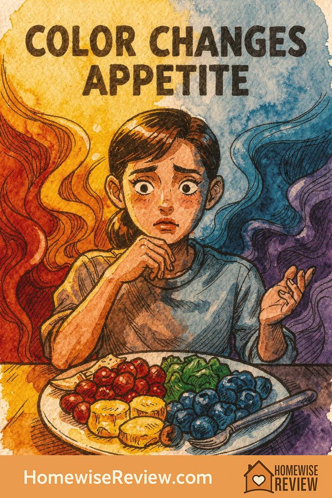
The overlooked mechanism: your brain tastes with its eyes first
Color works less like a magic switch and more like a context cue. Before you eat, your brain is already guessing what a food will taste like, how filling it will be, and whether it is worth your attention. Environmental color becomes part of that prediction system, especially when it is large-scale (walls, cabinets, backsplash) and paired with consistent routines (coffee, snacks, dinner).
Researchers in multisensory perception have repeatedly shown that visual cues can shift perceived sweetness, intensity, and flavor identity. In a kitchen, those cues include not just food and packaging, but also the “field” around it: wall color, counter tone, and lighting warmth.
Warm colors (red, orange, yellow) tend to raise arousal, not “hunger” directly
Warm hues are commonly associated with stimulation and approach motivation in color psychology models. Practically, that often shows up as more energy in the room, faster decisions, and a higher likelihood of grabbing something that is easy and rewarding.
- Where it helps: breakfast zones, family snack drawers (if you want them used), lively hosting spaces.
- Where it backfires: if you already feel rushed at dinner, or if late-night snacking is a pattern you are trying to interrupt.
One nuance people miss: warm colors can make a kitchen feel “cozier,” but they can also increase visual noise. In an already busy kitchen (small footprint, lots of appliances visible), a saturated warm wall can amplify stress rather than comfort.
Red: why it is powerful, and why it is usually best in small doses
Red is the most talked-about appetite color, but the stronger evidence is that red increases arousal and attention. That can translate into quicker eating, more impulsive snacking, and a room that feels active even when you want it calm.
If you love red, the data-friendly approach is to treat it like a seasoning: use it as an accent where you want energy, and keep the dominant surfaces calmer.
- High-impact, low-commitment: a red kettle, bar stools, a runner, or a single piece of art.
- Lower-risk paint placement: inside a pantry, a coffee nook, or a small breakfast corner rather than all four walls.
Yellow and orange are commonly linked to warmth, friendliness, and morning optimism. In kitchens, they can make the space feel more welcoming and awake, which is why you see them in breakfast brands and café design.
The catch is brightness control. Under cool LEDs or strong daylight, a bright yellow can turn sharp, and that sharpness reads as tension. If you want the benefit without the buzz, choose a muted, earthy version (think wheat, honey, terracotta) and pair it with warm lighting.
Cool colors (blue, green) often signal freshness and control, but can cool the food experience
Cool hues are frequently associated with calm, cleanliness, and “fresh” categories like water, herbs, and produce. They can be helpful if your goal is a kitchen that feels restorative and orderly.
However, there is a second effect: cool colors can make warm foods look less vibrant, especially under cool bulbs. If you have ever plated a cozy meal and thought it looked a little gray or flat, the room color and lighting may be part of why.
- Green’s sweet spot: soft sage and olive often support a “whole food” vibe without draining warmth from meals.
- Blue’s sweet spot: gray-blue or dusty blue can feel clean and classic, but it benefits from warm wood tones and warm lighting to keep food looking appetizing.
Neutrals (white, gray, black): the real appetite lever is contrast
Neutrals feel “safe” because they do not fight with food colors. But neutrals are not neutral to perception. The big variable is contrast, which affects how bold, rich, or “light” food appears.
- Bright white kitchens: amplify cleanliness cues, and they also make colorful foods pop. This can boost the appeal of fruit, salads, and vibrant meals.
- Medium gray kitchens: reduce glare, but can dull food if lighting is cool or weak. Gray often needs warmer bulbs and wood tones to avoid a flat look.
- Black or very dark kitchens: create drama and can make plated food feel “restaurant-level,” but only if you have strong, high-quality lighting so you do not eat in a cave.
If you want one practical rule: food looks most appetizing when it is clearly separated from the background. That is contrast in lightness (dark plate, light food) or contrast in hue (green salad on a neutral surface).
Lighting is the multiplier most color advice ignores
Two kitchens can have the same paint color and feel completely different because of lighting. If you take nothing else from this report, take this: lighting temperature can override paint psychology.
- Warm bulbs (around 2700K to 3000K): make foods look richer and more comforting, and they help warm or neutral paint colors feel welcoming.
- Neutral bulbs (around 3500K): a balanced middle that works for many kitchens, especially if you cook often.
- Cool bulbs (4000K+): can make kitchens feel crisp, but may drain warmth from dinner foods and make beige paints look slightly green or gray.
Also watch the color rendering of bulbs. When rendering is poor, tomatoes look dull, greens look tired, and everything feels less fresh. That changes perceived quality even when the food is great.
What housing data suggests people like in real life
Even if you are not selling, housing-market data is useful because it reflects large-scale preferences and emotional reactions at scale. Zillow’s paint color analysis has reported that certain kitchen hues correlate with higher sale prices, including a noted premium for light blue or soft gray-blue kitchens.
Do not read that as “blue increases home value everywhere.” Read it as: many people interpret a blue-gray kitchen as clean, calm, and updated, which are powerful emotional signals in a space tied to daily care and routines.
The dishware effect: your plates quietly shape “how filling” food feels
Kitchen color is the background, but your plates are the stage. Research in perception shows that plate color and background can change how we judge sweetness, richness, and intensity. The practical takeaway is not to obsess over perfect pairing, but to notice where your setup is working against your goals.
- Trying to make veggies feel more appealing: serve on high-contrast plates (often white or light plates) so greens and reds look vivid.
- Trying to make dessert feel more satisfying in smaller portions: use a plate that makes the dessert look intentional and “complete,” often a smaller plate with a clear border.
Color choices by goal (the quick, data-grounded cheat sheet)
| Goal | Colors that tend to support it | Common mistake |
|---|---|---|
| Calmer cooking and less grazing | Soft greens, blue-grays, warm whites, natural wood | Pairing cool paint with cool lighting so everything feels sterile |
| More energy in the morning | Gentle yellow, warm neutrals, sunny accents | Going too saturated, then feeling visually “buzzed” all day |
| Hosting and conversation | Warm neutrals, terracotta, controlled red accents | Using red as the dominant wall color in a small or cluttered kitchen |
| Making healthy food look more tempting | Clean whites, warm light woods, high-contrast plating | All-gray surfaces with low-contrast dishware |
Methodology: how this report was built
This analysis is a synthesis of peer-reviewed work in color psychology and multisensory flavor perception, plus large-sample housing-market analysis on paint colors. The emphasis is on effects that show up across multiple experiments or in real-world behavior, not on viral “color myths.”
- Included: review articles on color in psychological functioning, experimental findings on color’s role in flavor expectations, and large-scale paint color data from housing research.
- Excluded: single-study claims with unclear replication, and advice that ignores lighting and contrast.
- How to use it: treat color as a cue you can tune with paint, lighting, and dishware, then adjust based on your household’s patterns (snacking, stress, hosting frequency).
Buying Guides Based on This Data
If you are refining your kitchen beyond paint, start with best kitchen tools every home cook actually uses so your day-to-day workflow matches the mood you want. If clutter is driving stress more than color is, these kitchen gadgets that actually earn counter space help you keep surfaces calmer without sacrificing convenience. And if you love the “finished” feeling that makes a kitchen more welcoming, our guide to the best kitchen accessories to upgrade everyday cooking pairs nicely with a color refresh.
Frequently Asked Questions ▾
Is there one best kitchen color for appetite control?
No single color reliably reduces eating on its own. The more dependable levers are overall calm (less visual noise), lighting that supports realistic food color, and contrast that makes meals look intentional rather than accidental.
Does red actually make people eat more?
The strongest support is that red increases arousal and attention, which can nudge faster choices and more impulsive behavior. Whether that becomes “eating more” depends on routines, food availability, and how dominant the red is in the space.
Why do some blue kitchens feel cold even when they are pretty?
Blue paint plus cool lighting can reduce warmth in skin tones and in food appearance, making dinner look less rich. A warm bulb temperature and wood accents usually fix the “cold” feeling without repainting.
What is the fastest, lowest-cost way to test a color change?
Change lighting first, then test color in small zones: a peel-and-stick sample on the wall near your main prep area, and a simple swap in dishware color for a week. If the food looks better and the room feels calmer, you have a direction worth committing to.
As an Amazon Associate, we earn from qualifying purchases made through links on our site.